Timeline: Aug 2021 - Nov 2021 | Platform: iOS and Android App
Introduction
Design and implement a polling feature for a dating app to help lower instances of ghosting and increase interactions between users who have matched.
The global online dating market was valued at USD 9.65 billion in 2022 and is projected to register a compound annual growth rate (CAGR) of 7.4% from 2023 to 2030. (source)
Timeline
1. Research
2. Wireframes
3. Prototypes
4. User Testing
5. Feedback and future considerations
Problem
Primary research consisting of surveys and interviews was conducted to understand the current challenges dating app users face with the common problems being:
• Apparent ghosting.
• Outdated chatting functions.
• Same old conversation.
• Chore to come up with new icebreakers.
This results in 91.4% of people having dry and low-quality conversations and 71.4% of people wanting the app to assist in initiating and aiding with conversational starters.

Defining the problem
How can we redesign a better experience for users to create more meaningful conversations?
Goal
Lowering instances of ghosting and increasing interactions between users who have matched.
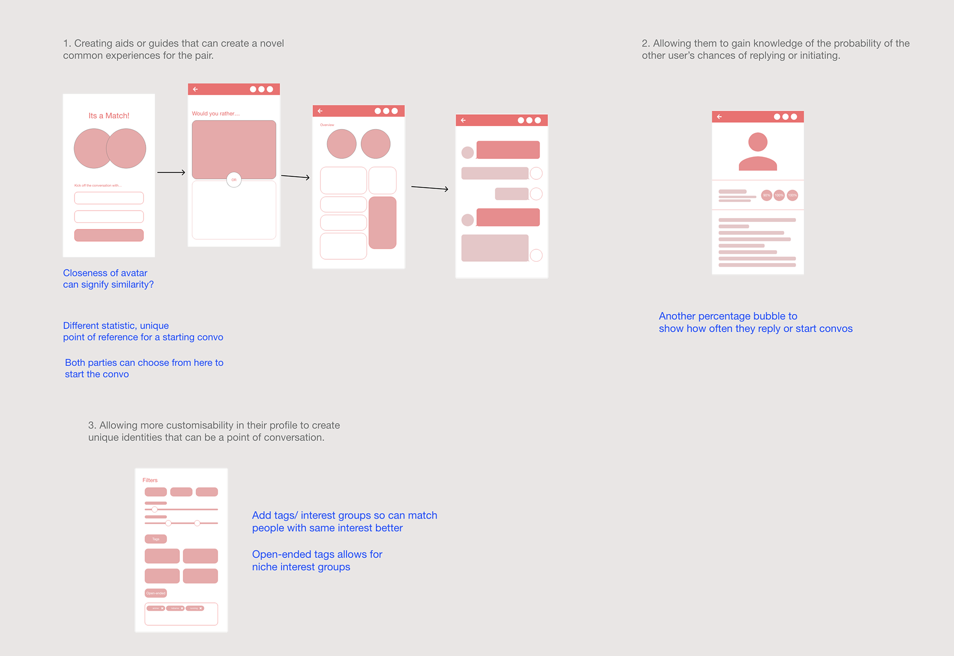
• Creating aids or guides that can create novel shared experiences for the pair.
• Allowing them to gain knowledge of the probability of the other user’s chances of replying or initiating.
• Allowing more customisability in their profile to create unique identities that can be a point of conversation.
Early Ideation
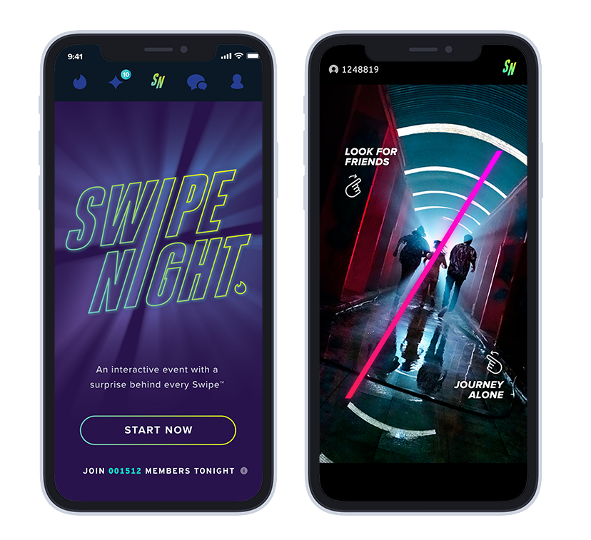
Existing solutions: Tinder's Swipe Night
One solution that stood out the most was Tinder’s Swipe Night where they created an interactive video series that all users can act upon. They then use the users’ choices as conversational starters for users who have matches with each other.
However, there are a few limitations:
• Not long-lasting. It is a one-time event.
• Not sustainable. It requires a lot of man-hours to create the video series, making it hard to recreate the same level of engagement
• Not customisable. Yes, many are more engaged but there would be some who are not very interested in the topics featured in the event
• Not equitable. Since it was a video series, some minority groups may not be able to relate to or access the feature. Screen readers may not be a feature of videos.
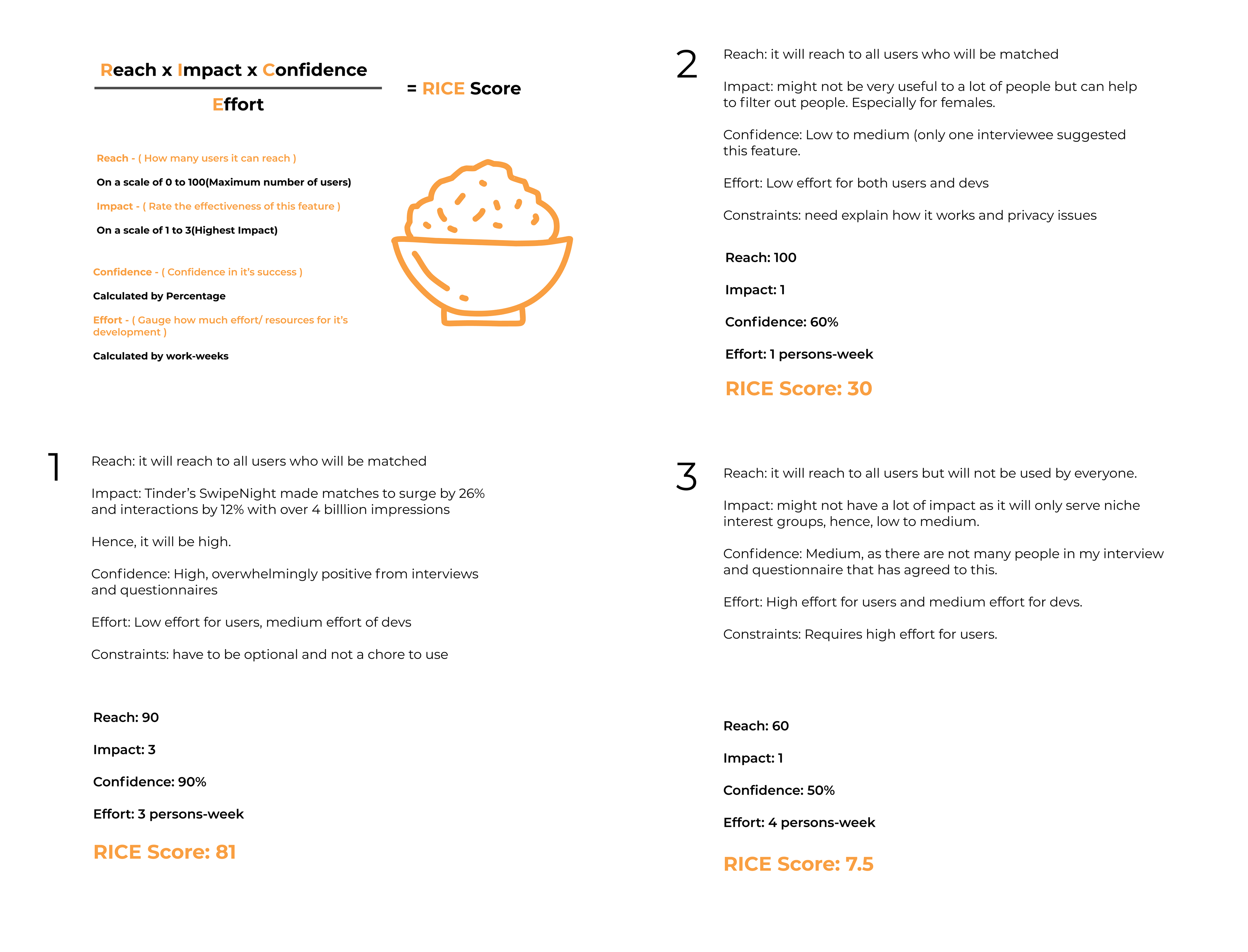
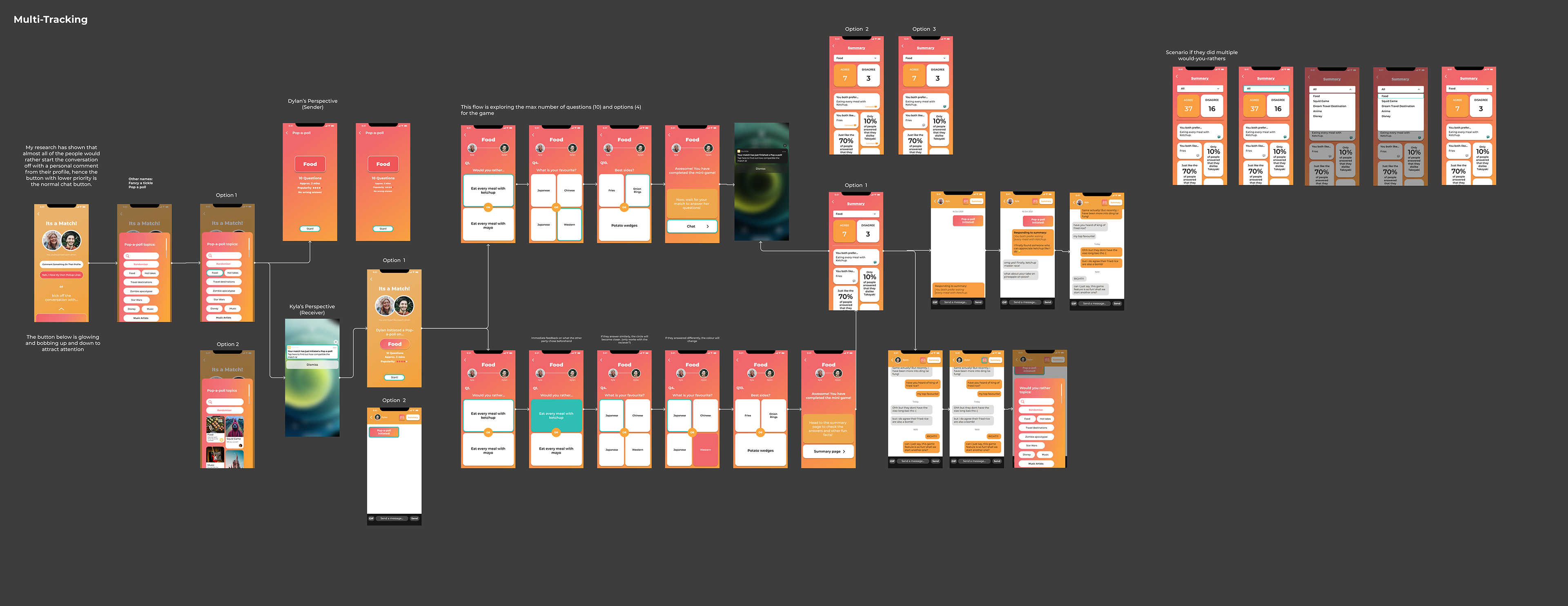
Lofi and RICE Priority
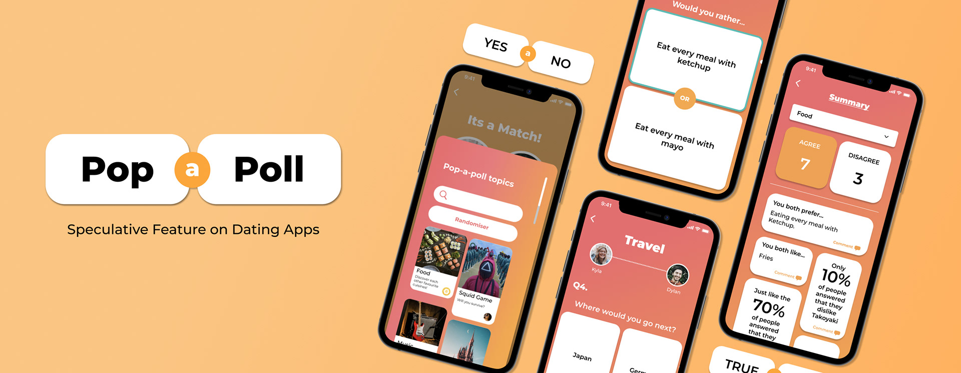
Final Designs
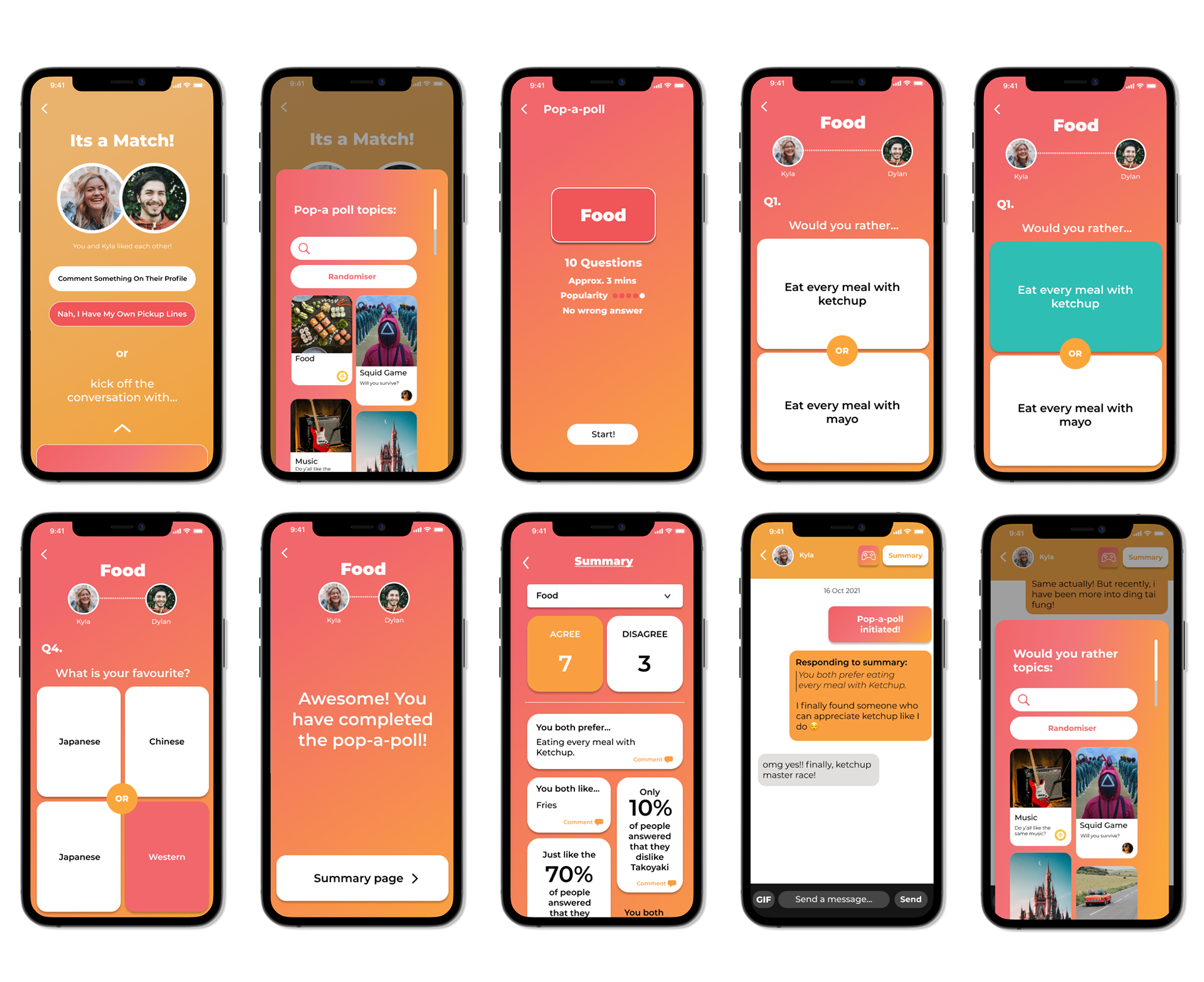
Some of the key design decisions I made included creating a simple and intuitive interface that allows users to quickly create and participate in polls.
Using visuals and photos as thumbnails to make the polls more visually appealing.
The information gathered from however many Polls that they have finished will be summarised in the "Summary" page, neatly into topics and can show the similarity and differences in their opinions. This will allow them to see how much they differ from each other, creating a conversation that could be important.
I also made the copy welcoming and reminded users that there were no correct answers to the poll as the answers are binary and opinionated.
Accessibility
Visuals and pictures are always paired with texts so that users will be able to use text-to-speech to read. As for the colour contrast, I used colours that invoke a warmer tone while not being too saturated, so it does not strain the eye.
Hence I chose the primary colour to be muted red and the accent colour to be mustard. When blended in a gradient, it has a nice sunset/sunrise which can get a warm and friendly vibe.
As for text, most of the polls are pure white and black to give excellent contrast of 21:1. As for texts in the background they are white which may not be the best for contrast, but their font is very bold, making their shapes easy to read.
HiFi Prototyping
User Testing
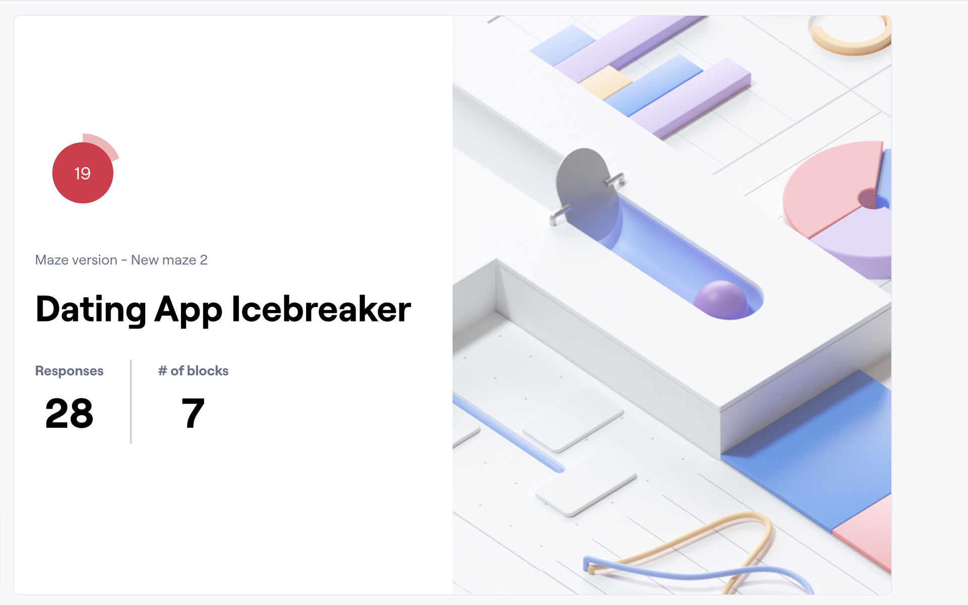
To ensure a seamless user experience, I used Maze for user testing. Maze is a tool that allows designers to create and run user tests and analyze the results.
Testing objectives: Evaluate the usability and desirability of the poll feature among existing dating app users.
Testing method: I created a prototype of the app that included the poll feature and tested it with a sample of existing dating app users using Maze.
Testing results: The majority of the users found the poll feature desirable and easy to use. However, some users provided constructive feedback, which I plan to incorporate in future iterations of the feature.
Click here for the feedback and my reflections.
Challenges
One of the biggest design challenges was creating a seamless user experience that integrated the polls into the chat interface without disrupting the flow of conversation. To overcome this, I conducted A/B tests to show variations in the details of navigation buttons and to ensure a more refined design so that the polls were easy to access and use.
Future Steps
Considerations
In the future, we plan to focus on incorporating more micro-interactions to make the user journey smoother, using feedback to create more pages for users to navigate the app, and continuing to gather feedback to improve the feature's usability and effectiveness.
Takeaways
Overall, I believe that Pop-a-Poll will allow users to have more meaningful conversations and increase the likelihood of successful matches. This is one of the first times doing a project that is fully a traditional “UI/UX” phone app project and it opened my eyes to how detailed each part of the process can be and how every small detail that is featured in the User Interface was carefully considered only after knowing the users. It was a really fun experience and I can see the importance of creating a great user experience with a great user interface.